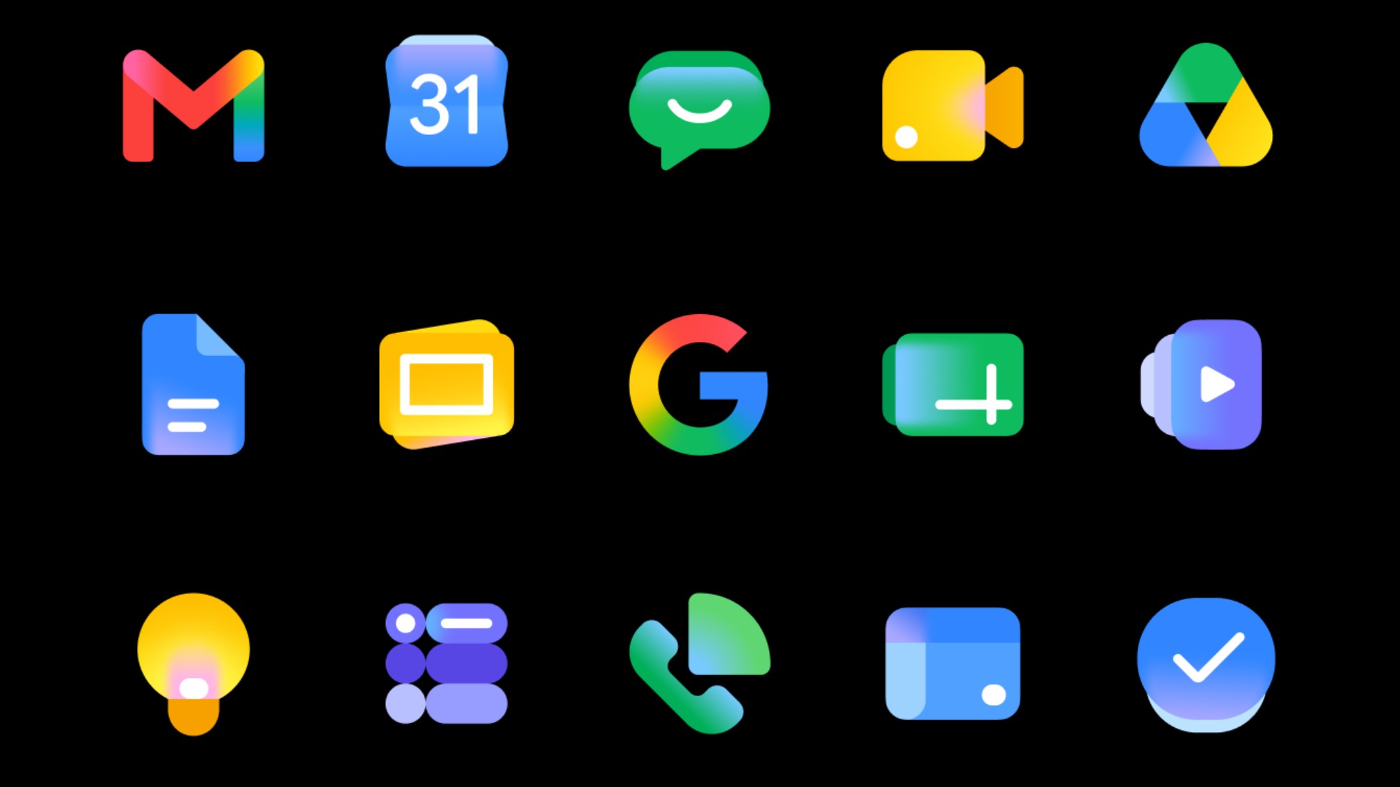
Google is rolling out a fresh visual identity across its sprawling ecosystem of applications, officially introducing a new set of icon designs. This comprehensive refresh is not just a cosmetic update; it's a strategic move to imbue Google's diverse suite of products with what the company describes as 'a more distinct identity.' The goal is to create a more unified and recognizable brand presence, even as the number of Google services continues to expand.
Affiliate contentGames up to -90% off
Instant key delivery on Instant Gaming
Browse deals →The updated icons are characterized by a refined aesthetic that often simplifies existing designs while retaining their core elements. This ensures that users will still instantly recognize their favorite Google apps, from Gmail to Maps to Drive, but with a subtly modern twist. The design language appears to emphasize clarity, legibility, and a sense of consistency, which is crucial for a brand with such a vast global footprint and user base.
Beyond mere aesthetics, these icon changes often reflect underlying philosophical shifts in design thinking, emphasizing usability and accessibility. By harmonizing the visual experience across different platforms and products, Google aims to improve the overall user journey, making navigation more intuitive and the brand experience more seamless. This formal introduction marks the culmination of an iterative design process, and users can expect to see these new icons progressively appearing across their devices and within Google's web services in the coming weeks and months.