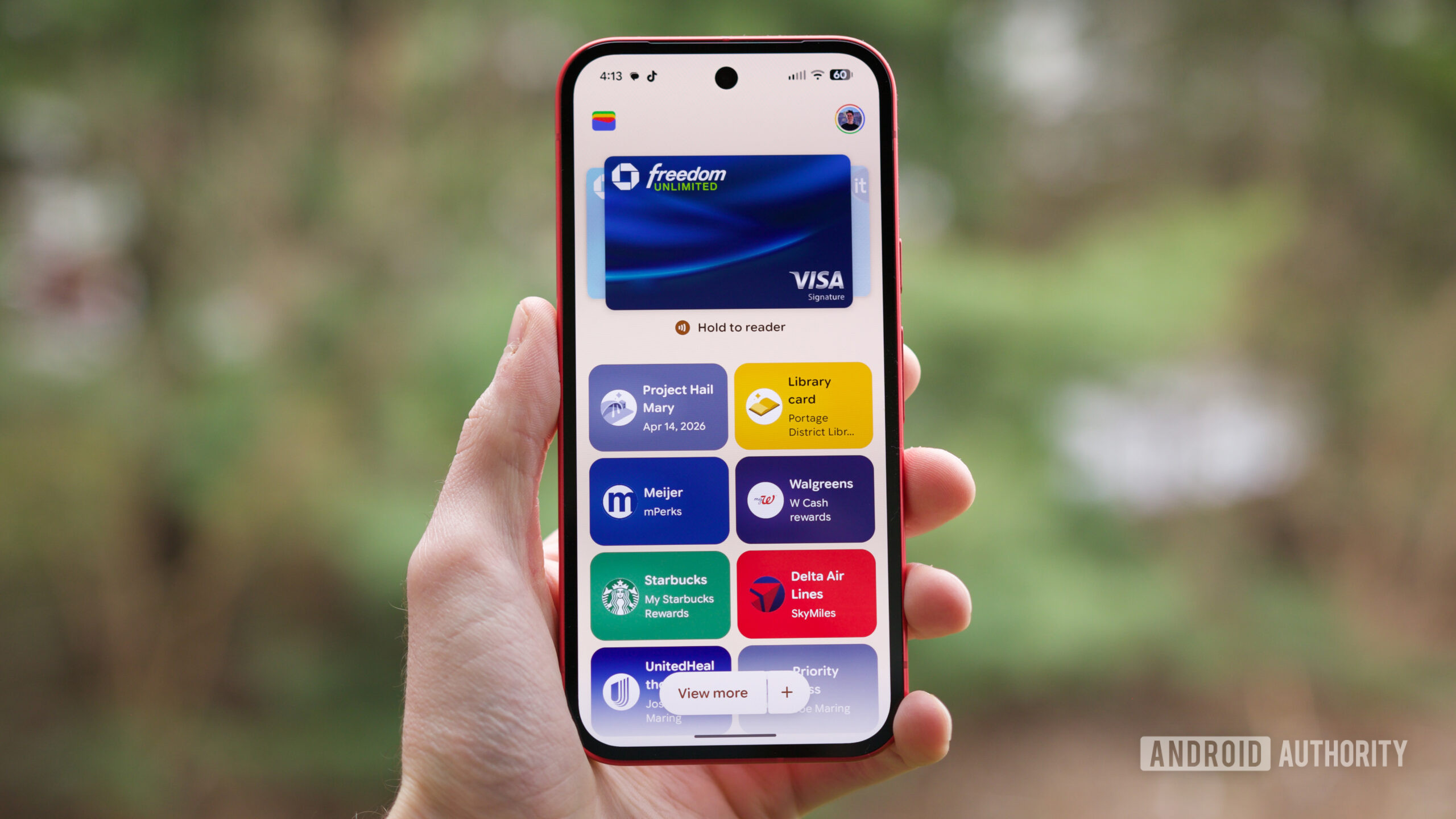
Google Wallet's latest UI overhaul has sparked a debate among its users, with a significant segment expressing dissatisfaction over the changes. While interface redesigns are often met with initial resistance, the current iteration seems to have introduced several points of friction for long-time users.
Affiliate contentGames up to -90% off
Instant key delivery on Instant Gaming
Browse deals →A primary grievance revolves around the perception that the new design has made accessing essential elements, such as loyalty cards, event tickets, and transit passes, less intuitive. Users report that items previously available at a glance now require extra taps or deeper navigation, contradicting the principle of making daily transactions quicker and more seamless. This added complexity negates one of Wallet's core appeals: swift access to digital essentials.
Furthermore, the rollout of this new interface has been criticized for its inconsistency. Many users report that the update has been slow to reach their devices, or that certain promised features are not yet available in their region, leading to a fragmented user experience. This staggered deployment can create confusion and frustration, as expectations built around announcements are not uniformly met. While Google often tweaks its apps over time, the current sentiment suggests that this particular update may have prioritized aesthetic changes over functional improvements, leaving some users longing for the clarity and efficiency of the previous design and highlighting the delicate balance between modernization and user habit.