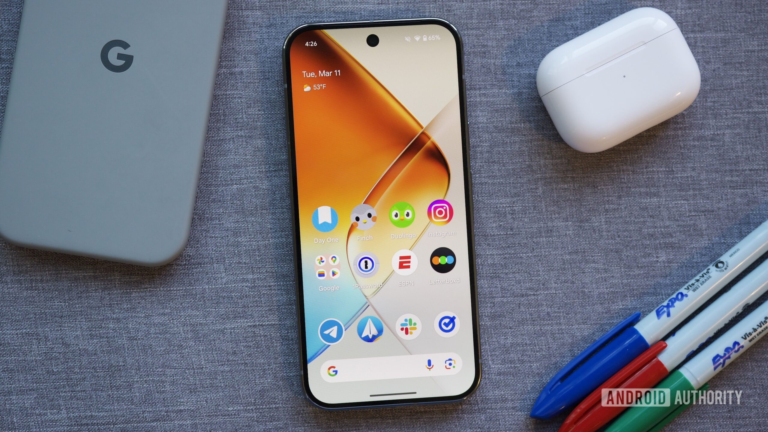
The Google Pixel Launcher has always been synonymous with a clean, minimalist Android experience, and recent updates have undeniably elevated its functionality and aesthetic appeal. Users now enjoy a more refined interface, smoother animations, and smarter integrations with Google’s ecosystem. The At a Glance widget, for instance, has become even more predictive and useful, providing timely information without needing to open multiple apps. The search bar integration also consistently offers quick access to device content and web results, solidifying its position as a central hub for navigation.
Affiliate contentGames up to -90% off
Instant key delivery on Instant Gaming
Browse deals →However, despite these laudable enhancements, the Pixel Launcher continues to overlook several fundamental features that are commonplace in many third-party launchers and even some OEM offerings. One of the most frequently requested omissions is the lack of extensive icon pack support; users are largely restricted to the default Google iconography, limiting personalization options. Deep customization for layout grids, beyond a few basic options, is also notably absent, preventing users from fine-tuning their home screen to their exact preferences. While widgets have improved, the ability to stack them directly on the home screen, similar to iOS or more advanced Android launchers, remains elusive, which would optimize screen real estate and reduce clutter.
Furthermore, gesture navigation within the launcher could be more robust, offering more advanced options for quick actions. The app drawer, while functional, lacks advanced sorting or categorization tools, making it cumbersome for users with a large number of applications. These missing elements, while seemingly minor, collectively prevent the Pixel Launcher from achieving true 'power user' status, leaving a segment of its audience craving more control and customization over their primary interface. While good, it still has room to grow into a truly exceptional launcher.